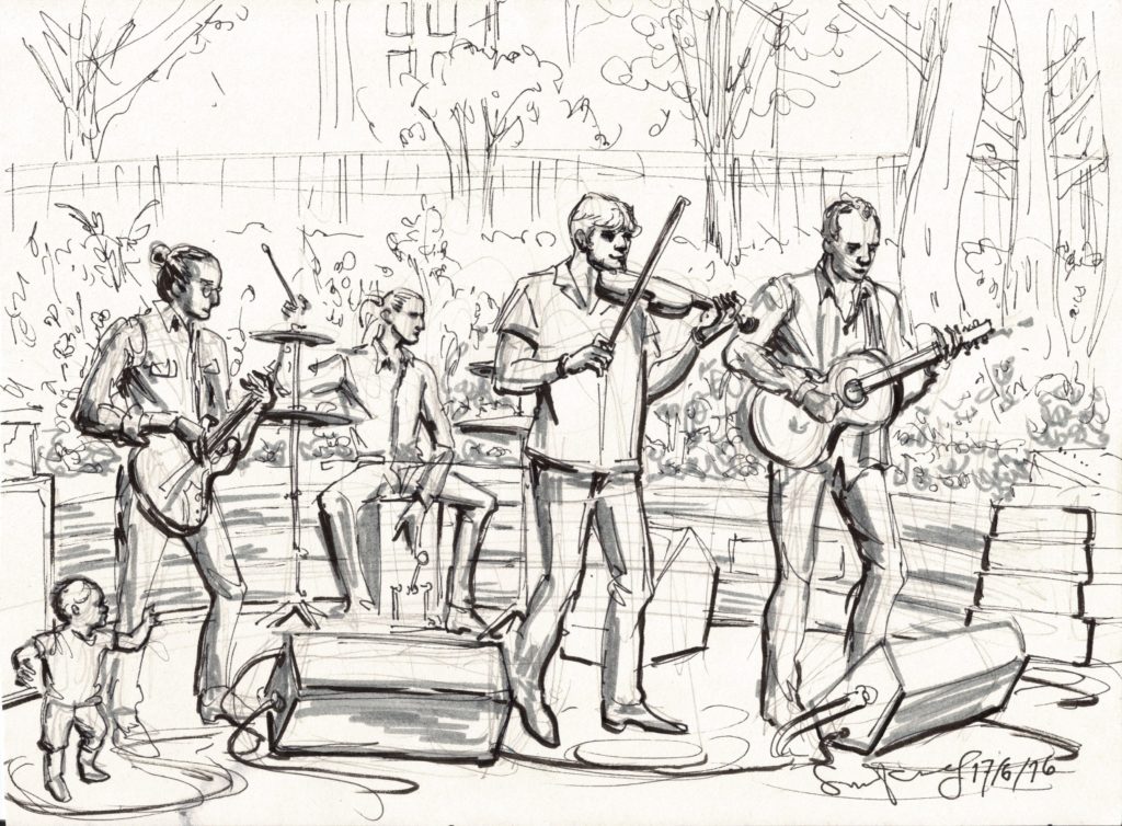
 Here’s a sketch from the five-year anniversary party of the wonderful company my husband works for.

 This is how I did it- first pencil sketch for structure and gesture, then a 50% grey pen to spot in midtones, then fine line outline, then brush pen strokes for the heavy line weight on the undersides of things and solid blacks.
This approach is a callback to the old-school commercial illustrators’ pen and marker techniques I learned from books in the 80s. Scan to the right: detail of pg. 27 from “Advertising Layout Techniques” by Harry Borgman, pub. 1983.
I loved this style of rendering because it was about drawing– it was didactic as hell, a formatted iconography for storytelling through pictures. The audience had been taught to read the visual language of illustration and comics over decades. They had an encoded understanding of what kind of mark-making represented what textile, what line weight meant highlights, what kind of shadows meant black or white surfaces.
I have a whole collection of books in my art library that offer instruction in now-obsolete techniques like Prismacolor and Chartpak markers and beloved, vanished Zip-A-Tone.* The earliest layers of my library reveal just how little I ever intended to be a fine artist- I just wanted to be a working stiff journeyman illustrator.

Detail pg 18 from New York The Big City by Will Eisner 1986

The grey-scale rendering methods of the great 20th Century advertising artists were already disappearing from the curriculum of art schools in 1989, when I left New York. They stayed alive in comics for a few years longer, because of the specific exigencies of comic printing before direct digital and the Black-and-White Boom.
By the time I was sober and enrolled in the Minneapolis College of Art & Design, in 1990, the career emphasis had shifted to digital graphic production. There were computer labs and programs like Illustrator and Photoshop and the illustration program at MCAD was skeletal. Teaching drawing for commercial art was over.
 Lucky for me, I was able to become a painter. I pivoted to FIne Art in the MCAD curriculum just to get enough teaching in things I cared about, but there were many hidden benefits to leaving the commercial illustration track, and I had some fine teachers.

Tiepolo Meeting of Antony and Cleopatra
One of my painting teachers at MCAD told me my preparatory sketch for a painting reminded him of Tiepolo‘s ink wash drawings. He showed me what he meant and I was amazed at how modern an eighteenth-century drawing could look.
Of course, we don’t know how Tiepolo produced these works- he might have done the pencil sketch and line-work first, then added the midtone wash. Either way, the grey-scale (or sepia-scale!) is a thing of beauty.

I hope to do some ink-wash drawings utilising grey scale values later this summer, as well as some chalk drawings on grey paper. I’ve been thinking about how Sargent said if you get the midtones right, everything else falls into place. I’ve never been a midtone person; I’ve always focused on line quality and hard black and white values. But people change 🙂
*Note: as of Nov 2020, incredible artist MechanicalPencilGirl sells home-made Zip dot screens, on adhesive matte film, in a wide range of density, plus grids and grits!!!