 Weirder than the chickens?
Possibly yes! Illustration classes are always weird – I’m sure they are STILL weird- because clients are weird. The class has to prepare you to be asked to illustrate some peculiar ideas! And my excellent Illustration teacher at MCAD, Tom Garrett, was a working professional illustrator.
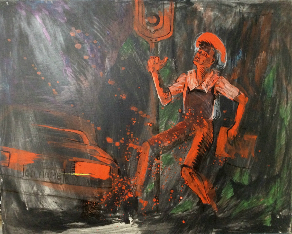 You never know what weird stuff clients might send you as a concept.
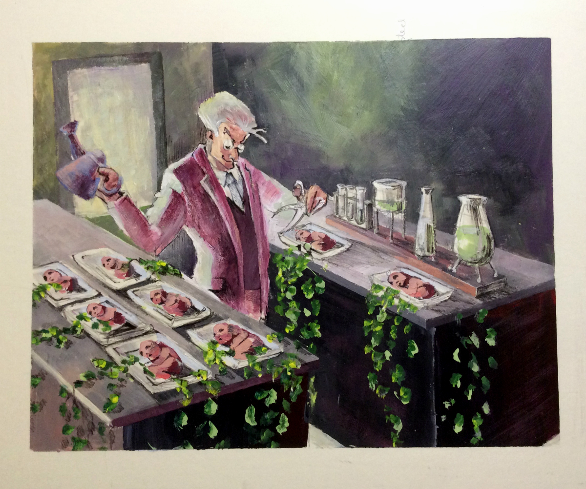
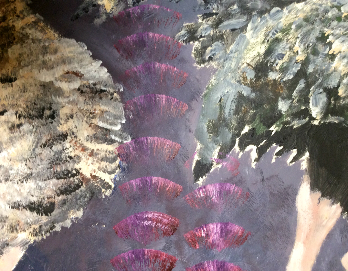
I have no memory or idea what this class assignment was about. It’s kind of a cool image though! I like the way I used the red!
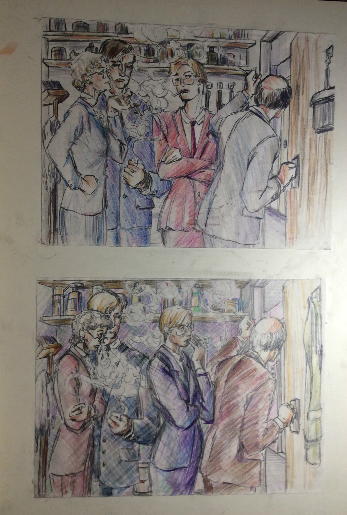
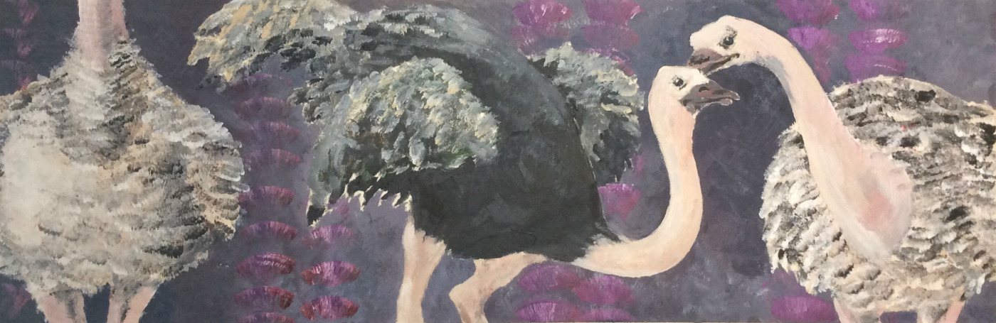 Ok, now what? Ostriches in a lingerie palette!
 I vaguely remember being given ostrich photo reference for this one. It was pre-internet, so Tom Garrett often supplied photo reference, rather than all of us having to go to the library to get a picture of a whatever.
I do not remember what the concept was, or why “the client” wanted ostriches. Why do they look like a La Perla ad?
You can see the way I was playing with handling the paint, with mark-making, in the safe space of Tom’s class. I still kinda love the technique. I draw ostrich feathers all the time for burlesque dancers, and I’m gonna ask the next one I paint to bring some so I can try to revive this approach!
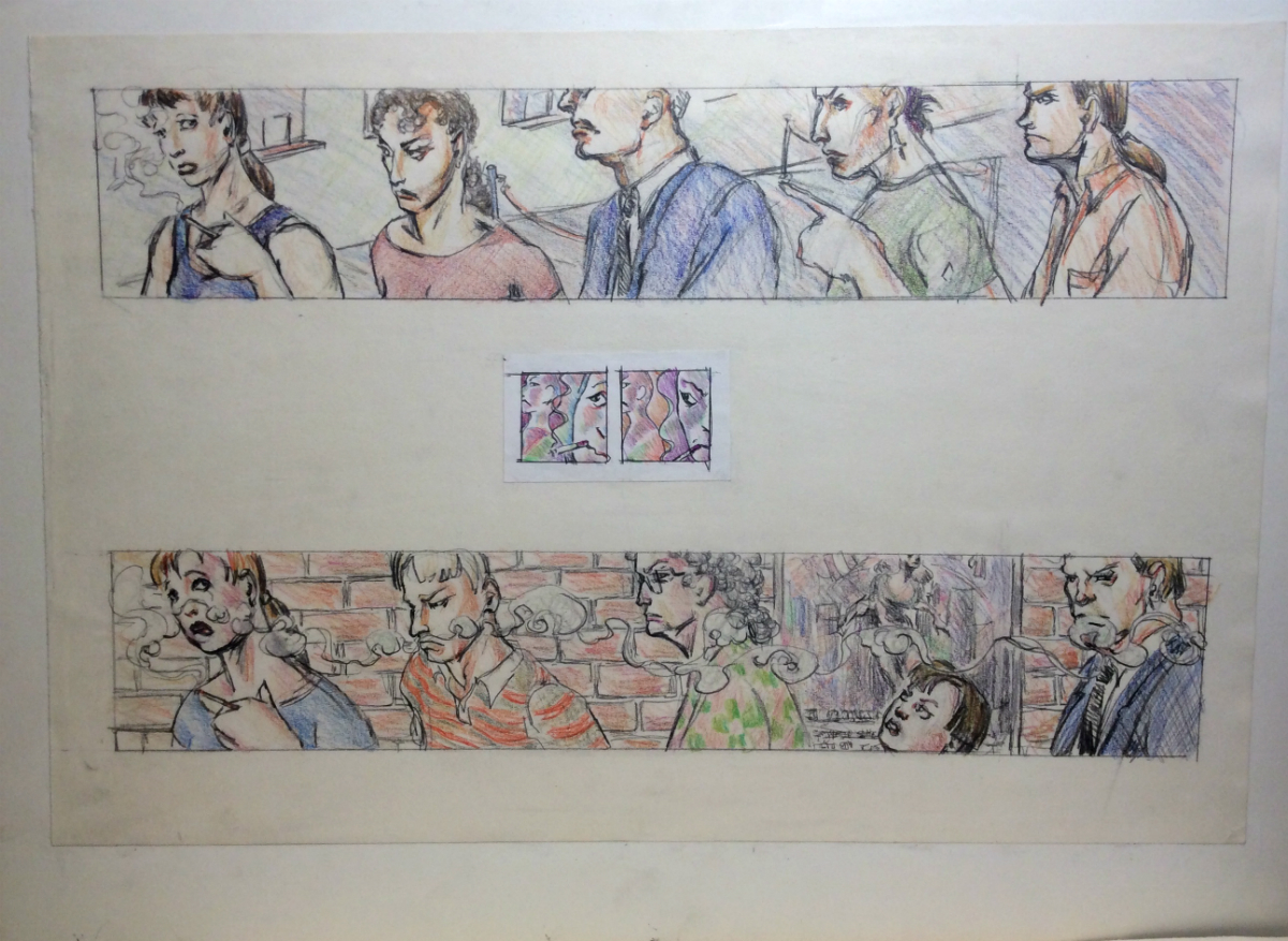
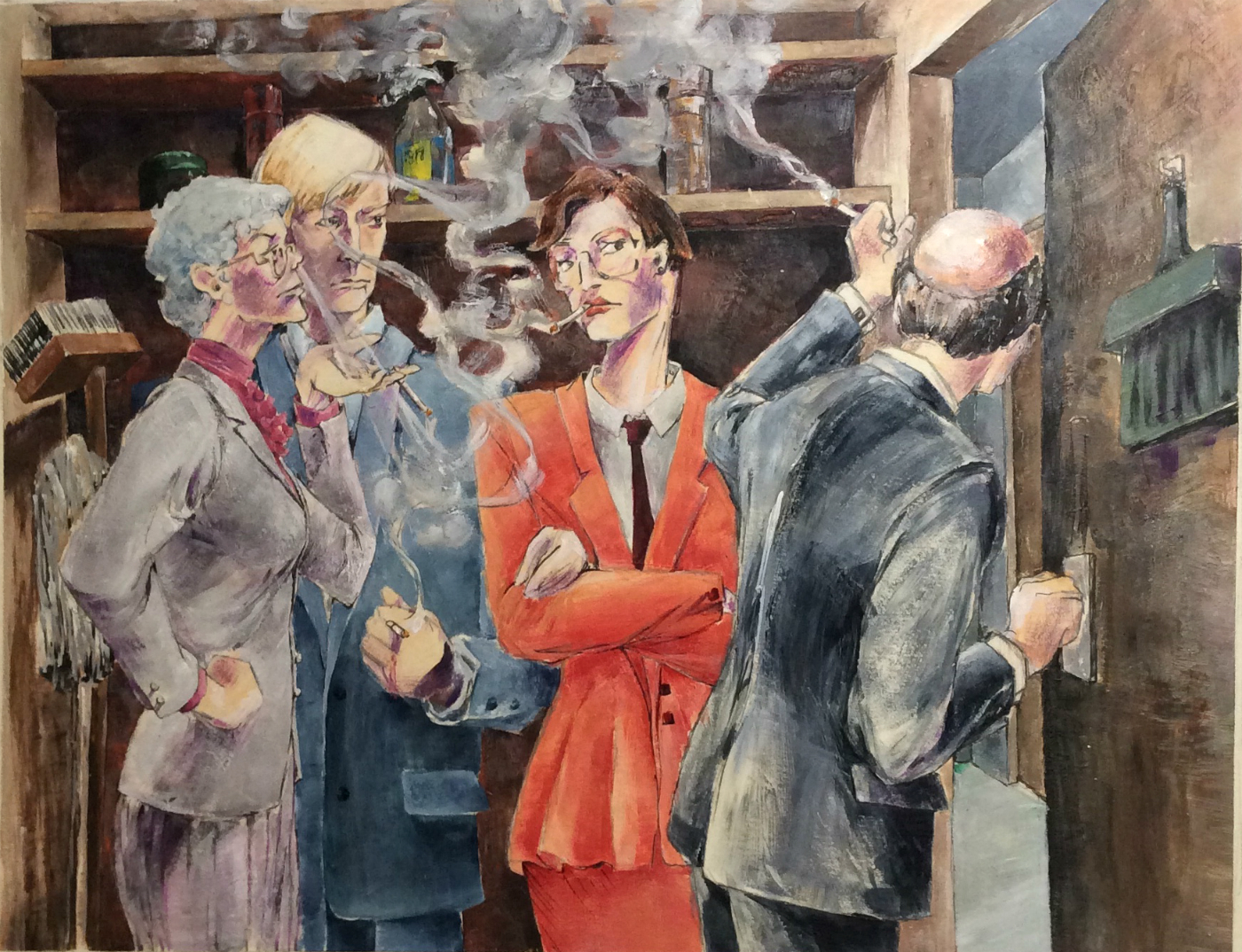
 I do remember the smokers.
We did so many variants on the smokers – first sketches, then colored pencil comps, then actual paintings. It was during the period when smoking indoors was first being banned in places, the early ’90s, so that’s what these were about.
 As a two-pack-a-day smoker until Jan 27, 1991, I was very indignant about smoking bans!!
Even after I quit! Honestly, even now! I know they are deadly, but I love the smell of second-hand smoke, which is yet another reason why it’s good I live in Berlin!
 The weird long panels were one of the standard commercial illustration magazine art/ad panel sizes.
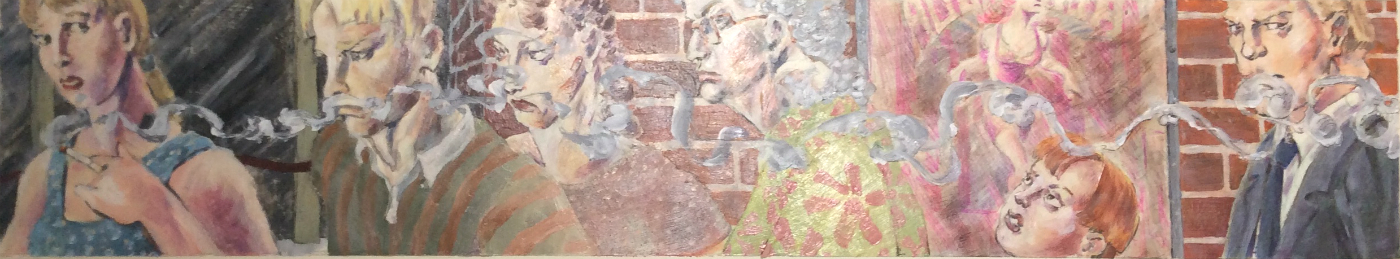
We learned all of them although of course all I remember is that one was called “subway”. These illustrations were done in such an evolving matrix of techniques – this one involved painting over the colored pencil with glazes of acrylic, tinted with paint!
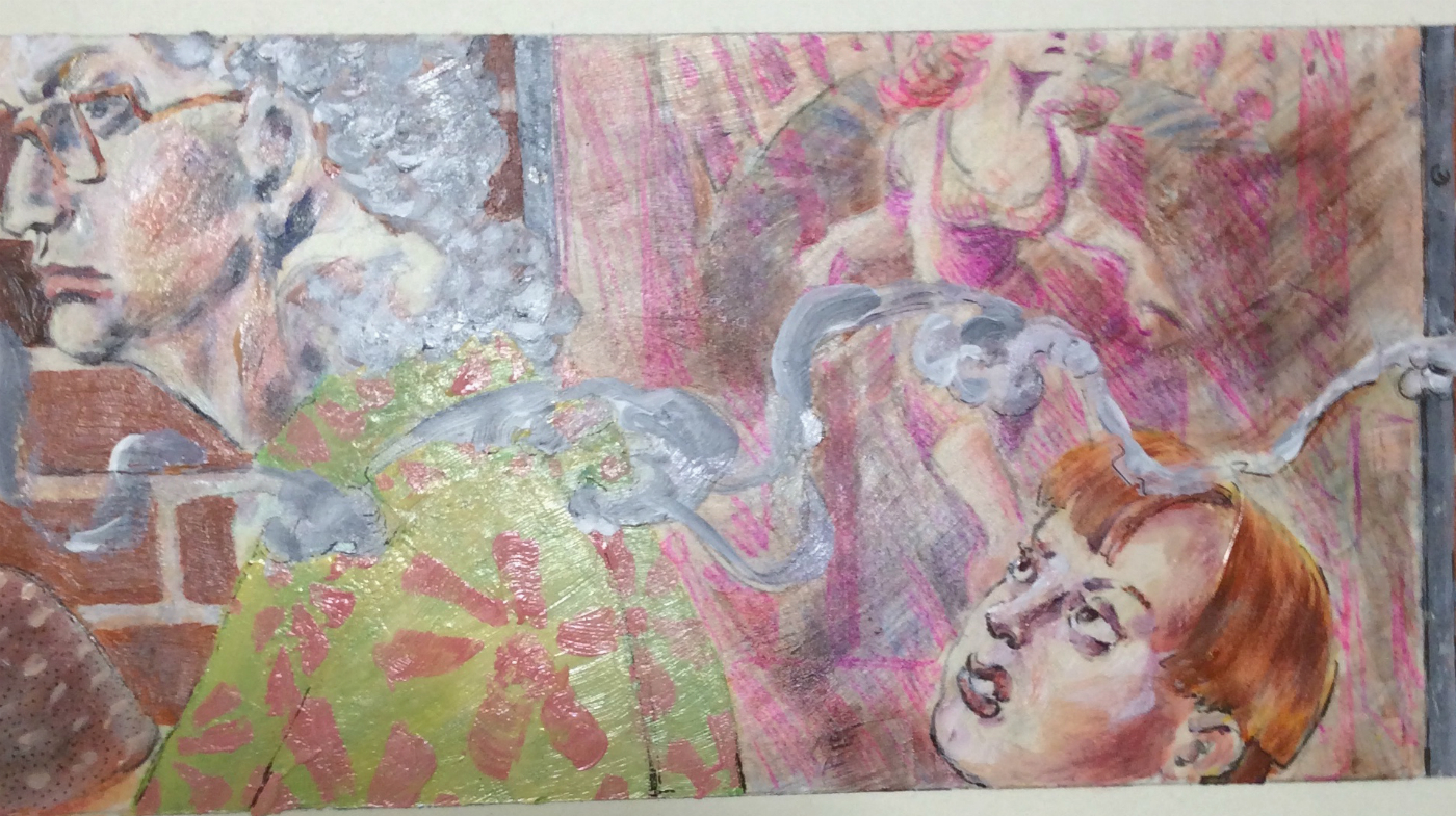 You can see the glossy surface from the glazes, and even the blushes of color where liquid paint overlaid color pencil. Since both the color pencil comps and the final still exist, I must have transferred the drawing outline onto illustration board for the final with graphite transfer paper. Which maybe still exists, unlike Letraset!
 I put so much time into these pieces!
Even though I didn’t intend to become a commercial illustrator anymore, there were a lot of people in comics using hybrid mixed media illustration techniques as the printing technology improved. I felt some of this practice would be transferable to my work in comics, and also I had such respect for my teacher!
I still like the weird style of these works and the expressiveness of the drawing. I’m glad I saved them, and transported them from St. Paul to Hartford to DC to Arlington to Alameda to Albany to Berkeley to North Berkeley to Albany to Oakland to Berlin. They have been in storage three times. I’ve had fifteen apartments, dozens of jobs, and three husbands.
But I held onto my work that whole time, because that’s what I was trained to do in school. At The Art Student’s League as a child, at Parsons as a teen, at MCAD – we were told to preserve our archives. And it was worth it, to me, because seeing these works again is a revelation in terms of technique and approach!
Only two of these pieces have ever been photographed; no modern media record of them existed – if we had a fire or flood they would just be gone forever.
I am incredibly grateful to my Patreon Patrons, whose monthly financial support makes it possible for me to take time to document my art archives.


